Pulse
Analytics dashboard demonstration — data-dense UI with clear hierarchy, dark mode and responsive layouts down to mobile.
- Year
- 2026
- Services
UI design
Design system
Frontend development
- Technologies
- ReactTypeScriptTailwind CSSRecharts
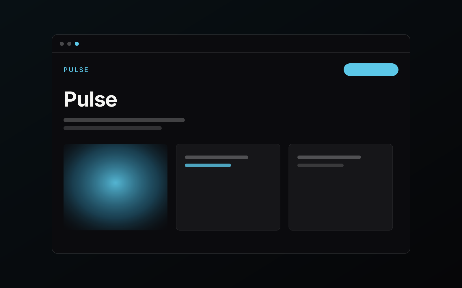
Pulse is a portfolio demonstration of product UI work: a realistic analytics dashboard with charts, tables, filters and empty states — the unglamorous details that decide whether a product feels professional.
The challenge
Dashboards live or die by hierarchy: every screen competes for attention with numbers, charts and controls. The demo needed to show restraint — making dense data scannable instead of decorating it.
The solution
An 8-point spacing system, a strict two-level type scale and a single accent color reserved for interactive elements. Charts use muted sequential palettes; state changes are communicated with motion under 200 ms.
The result
A component library of 30+ production-grade UI pieces — cards, charts, tables, filters, empty and loading states — demonstrating how I approach real product frontend work.
Planning something similar?
Every project starts with a short conversation — no obligation, no sales pressure.